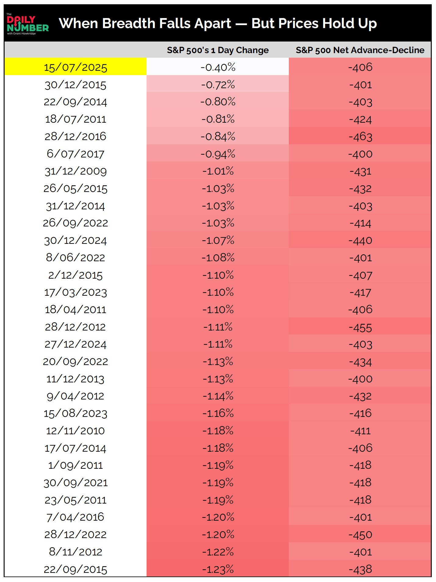
The S&P 500 slipped just 0.4%, but net decliners totaled –406.
Here’s the table:
Let's break down what the table shows:
This table highlights the 30 most extreme S&P 500 trading days since 2005, where internal breadth collapsed despite a small daily price change.
The first column shows the date.
The middle column displays the S&P 500’s 1-day percentage change.
The final column shows net advance-decline — the number of stocks down minus those up within the S&P 500.
The Takeaway: Yesterday wasn’t a crash, but under the hood, it was one ugly session.
The S&P 500 slipped just 0.4%, yet 406 more stocks declined than rose — the most severe internal damage we’ve seen in 20 years with that small of a price move.
This kind of divergence is rare.
It’s a hallmark of stealth distribution when mega-cap strength masks broad-based weakness.
We’ve seen this setup before: the index stays afloat, but sellers are quietly in control beneath the surface.
Looking at the 30 most extreme examples since 2005 — the same ones in this table — short-term follow-through has been mixed.
1-month forward returns average just +0.4%, with only 57% of cases positive.
But over time, conditions tend to stabilize. 3-month returns average +1.7%, and 6-month returns were positive 74% of the time, with a median gain of +5.7%.
That doesn’t mean there’s no risk.
But it suggests these internal shocks, on their own, rarely end bull markets.
More often, they mark transitions from strength to rotation.
Are you watching the index — or what’s holding it up?
Grant Hawkridge | Chief Aussie Operator, All Star Charts
From breakout setups to sector rotation, we cover what matters. With Premium, you get curated watchlists like the “Hall of Famers” and “Freshly Squeezed” — plus our take on what to do with them.
If you find my content valuable, I would greatly appreciate it if you could share it with your friends, family, and colleagues. Your help in spreading the word is invaluable in supporting our work. Thank you to all of you who share!