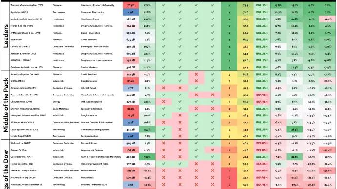
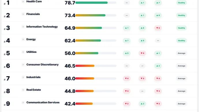
8 of the top 10 leaders in the Dow Jones Industrial Average are healthcare or financial stocks. That means the current leadership is not coming from the usual mega-cap tech playbook. It is...
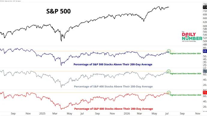
Two-thirds of stocks across the S&P 500, S&P 400, and S&P 600 are now trading above their 200-day moving averages. That means broad participation is showing up across...
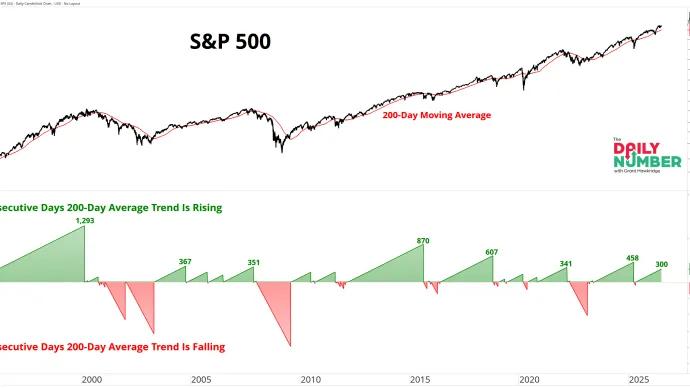
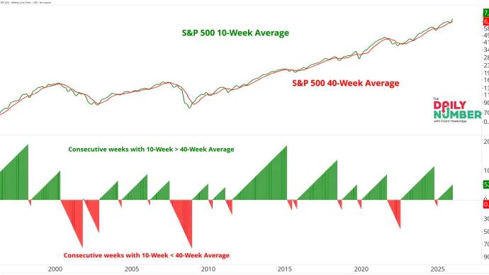
The S&P 500's 200-day moving average has now been rising for 300 consecutive trading days. That means the market's primary trend has been moving higher for roughly 14 months of...
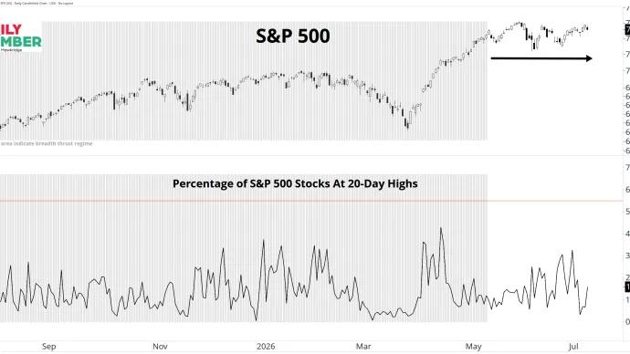
The S&P 500 has gained just 0.19% since the 20-day breadth thrust regime ended on 14 May 2026. The index hasn't fallen apart. It hasn't broken down. It has simply spent the past...
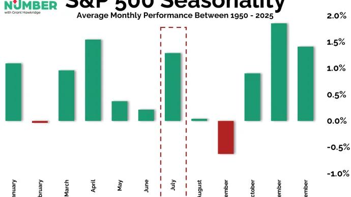
2026 is the second year of the four-year presidential cycle, better known as the midterm year. Historically, this part of the cycle can be difficult during the first half. But from around...
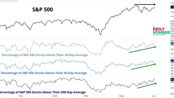
67.2% of S&P 500 stocks now trade above their 20-day moving average. The index has gone nowhere. Under the surface, the market tells a different story.
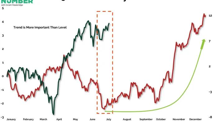
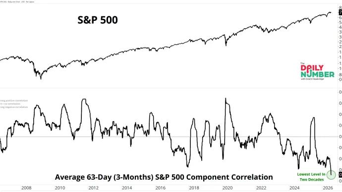
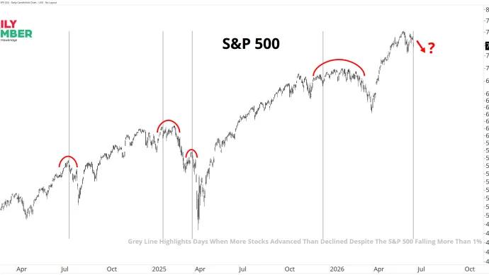
Most traders spent Thursday watching the technology sell off. Beneath the surface, one of the market's most important indicators was breaking to a new all-time high.
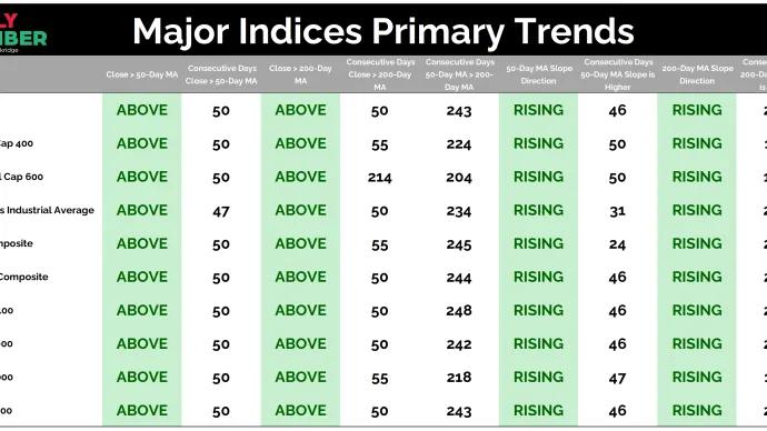
Zero major US stock market indices are below their 50-day moving average, below their 200-day moving average, or have a falling 200-day moving average.
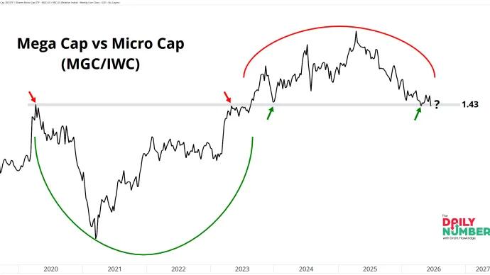
The ratio of Mega Cap stocks to Micro Cap stocks is sitting at 1.43. That's a level that has repeatedly acted as both support and resistance over the past six years.