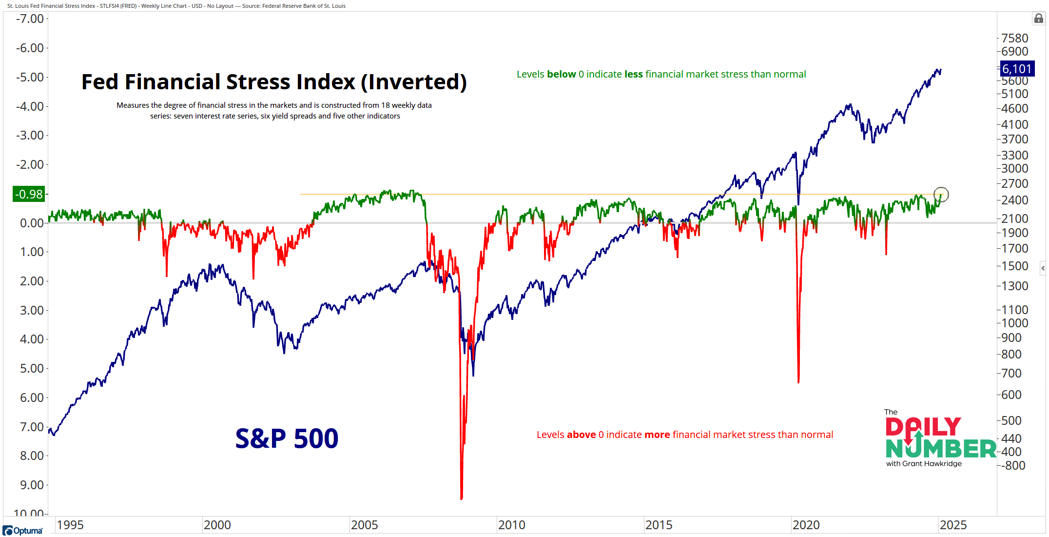
The St. Louis Fed Financial Stress Index has declined to -0.98, the lowest level this market stress index has seen in over 17 years.
Here’s the chart:
(right-click and open image in new tab to zoom in)
Let's break down what the chart shows:
The blue line represents the price of the S&P 500 index.
The greenand redline represent the St. Louis Fed Financial Stress Index (This data set has been inverted). When the line is green, it indicates that financial market stress is lower than normal. Conversely, when the line is red, it indicates that financial market stress is higher than normal.
The gray line represents the zero line for the St. Louis Fed Financial Stress Index, indicating normal financial market conditions.
The Takeaway: The St. Louis Fed Financial Stress Index measures financial stress in markets and is published by the Federal Reserve Bank of St. Louis. This index is constructed from 18 weekly data series: seven interest rate series, six yield spreads, and five other indicators. Each of these components provides insights into different aspects of financial stress.
The index is currently at its lowest level of market stress observed in the past 17 years. It has remained above the zero line for 96 consecutive weeks. During this period, the S&P 500 has experienced a gain of over 57%.
This is typical behavior of bull markets.
So, turn your attention to what the market data is actually telling us and not what they are saying on the mainstream financial media.
Grant Hawkridge | Chief Aussie Operator, All Star Charts
ICYMI: Louis, our crypto expert, went live on Monday to discuss the recent volatility in the crypto markets. He breaks down the reasons behind it and what to expect next.
If you find my content valuable, I would greatly appreciate it if you could share it with your friends, family, and colleagues. Your help in spreading the word is invaluable in supporting our work. Thank you to all of you who share!