That’s full global alignment — My Global Composite remains at 100%, with every major region trending higher.
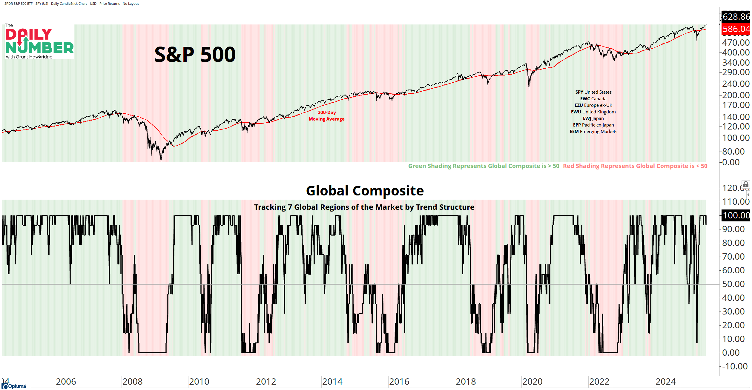
Here’s the chart:
Let's break down what the chart shows:
The top panel shows the S&P 500 daily price in black, with its 200-day moving average in red.
Green shading appears when the Global Composite is above 50; red shading when it’s below.
The bottom panel displays the Global Composite in black, tracking seven global regions based on trend structure.
The Takeaway: This is what full participation looks like.
When the Global Composite hits 100%, it means every major equity region — the US, Canada, Europe, UK, Japan, Pacific, and Emerging Markets — is in a confirmed structural uptrend. Price is above the 200-day moving average. And the 200-day is rising.
That’s not noise.
That’s conviction.
It’s rare to see all seven regions trending together — and when we do, it usually means the market’s firing on all cylinders.
This kind of global alignment signals synchronized risk appetite.
Buyers aren’t just chasing the US or a few leaders. They’re bidding up stocks everywhere.
This Composite isn’t a short-term signal. It’s a powerful context gauge.
Right now, every cylinder is firing. And unless we start seeing trend breakdowns in one or more regions, the burden of proof is still on the bears.
The world is leaning into equities.
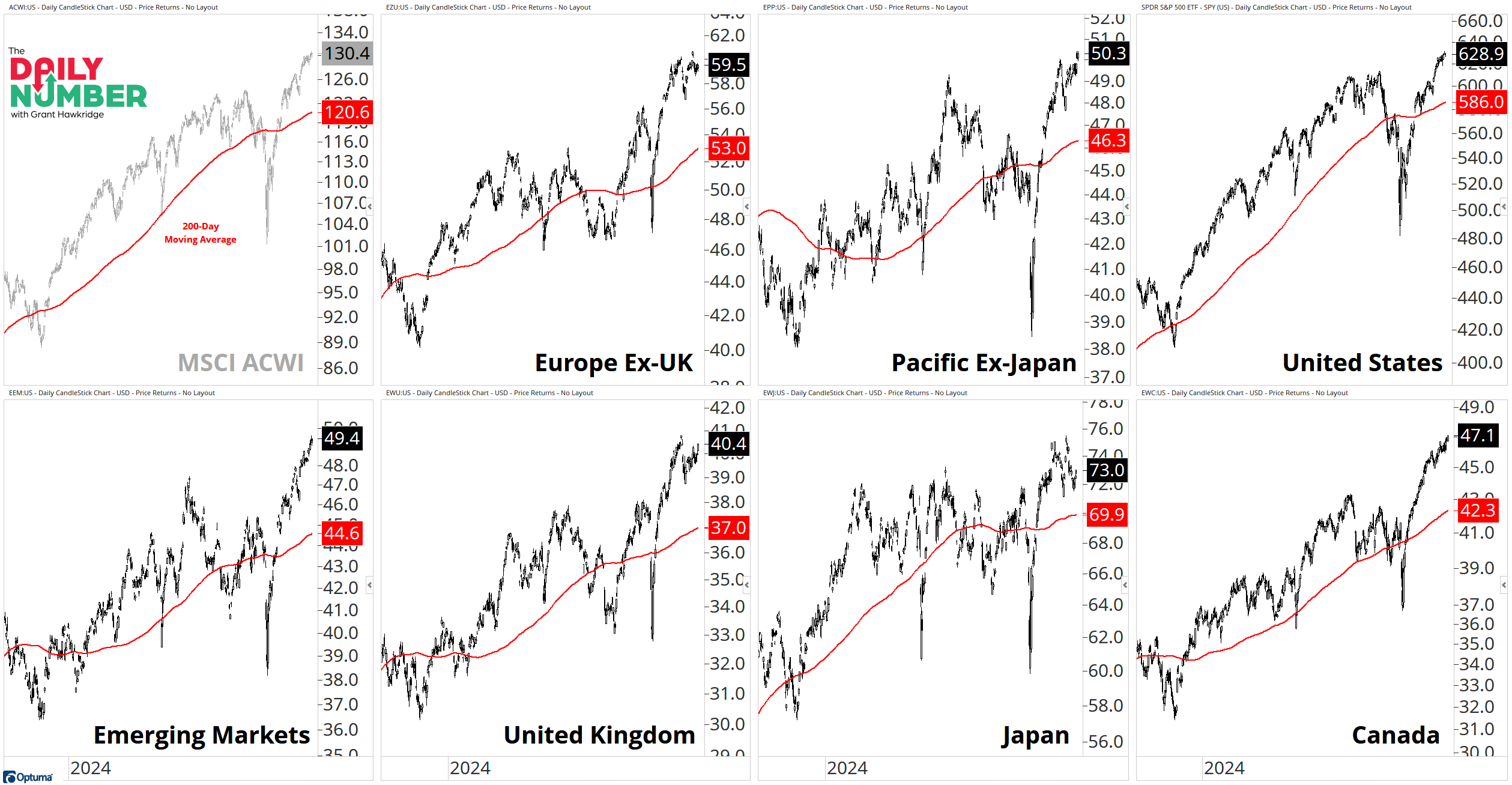
Bonus Chart: Here’s a look under the hood at each component of the Composite:
That’s not luck. That’s a fully tuned global engine.
So here’s the question: what breaks this — and when?
Grant Hawkridge | Chief Aussie Operator, All Star Charts
From breakout setups to sector rotation, we cover what matters. With Premium, you get curated watchlists like the “Hall of Famers” and “Freshly Squeezed” — plus our take on what to do with them.
If you find my content valuable, I would greatly appreciate it if you could share it with your friends, family, and colleagues. Your help in spreading the word is invaluable in supporting our work. Thank you to all of you who share!